Final draft
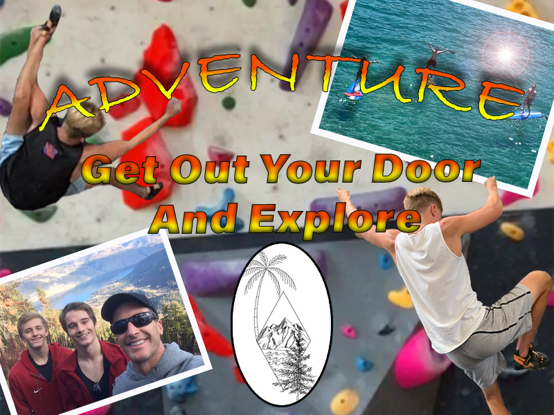
I really enjoyed my first photoshop project because of the freedom and creativity I was given for the assignment. At first for the project I was nervous because I had lots of trouble on the tutorials. But once I started, I began to really enjoy the process of creating the image. I think that my draft went really well I figured out how to solve a lot of the problems I faced while creating the image. The major problems I faced where trying to get the words of my photo to arch and look exactly how I wanted them too. And the other major problem I faced was trying to get my images look the specific way I wanted them to look compared to the rest. Fortunately, I was able to experiment and figure out creative ways to make the image pop and look the way I wanted. The major problems I faced with the revision was trying to get the words to pop out compared to the images, Fix the cutouts that I made so that they were not squared off, and I wanted to add a logo for my image so that people can identify easily. Everyone commented on my draft post that my words did not stand out compared to the rest of the image, and that I need to make them pop. So, I added a fade from yellow to red and added a black stoke to the words. These changes made the words pop out and easily readable for my audience. The next biggest thing that people commented on was my cutouts. I did was zoom into my cutouts and grabbed the erase tool and carefully tried to fix all of the squared edges around the cutouts. The last thing that I did was that I wanted to come up with a logo for my image. So a few months ago I got a tattoo and my artist sent me a clean drawn image of it, I thought that the image fit my theme so I used the oval tool and centered the image.
