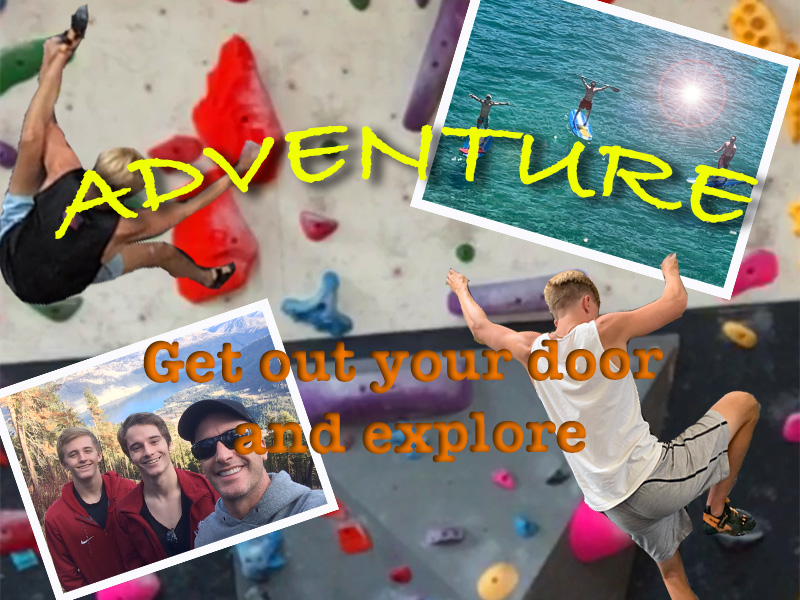
I really enjoyed making my first photoshop design. At first, I was really nervous because I had a very difficult time with the tutorials, but once I started working on it the project came naturally to me. I am proud that I didn’t use any images that didn’t belong to me. The most fun thing about this project is the trial and error. The reason I thought this to be the most fun about this assignment was because I learned a lot more about photoshop through my “happy accidents”. For example, while trying to put a boundary (stroke) around my photos on the top left and top right I found the layer style menu. At first this menu was very new and frustrating, but once I learned what each layer style did, I was able to edit my photos. The layer menu is the reason that there is a lens flare on my photo in the top left. Another example I had from the trial and error of this assignment was the bottom letters that read, “Get out your door and explore.” At first the letters were not popping out and I could hardly see them, so I thought that adding a shadow would make them pop out more for people to see. But I accidentally clicked on inner shadow rather than the regular shadow, so my shadow was inside the letters. I thought that this looked way better and popped out way more than the regular shadow. I also thought that the tutorials really helped me when putting this assignment together. For example, when trying to cut out the picture of my body I used the quick select tool, but that was not working it took too much of the wall behind me. So, I used something I learned in the tutorials, which was the magnetic lasso. The magnetic lasso really helped me with all of my cutouts for this assignment. One of the things I am most proud of about this assignment is that I knew I needed a background, so I just used the upper half of one of my photos and made the colors pop more with the hue saturation tool. Overall, I really enjoyed the freedom, creativity, and the trial and error that went along with doing this assignment.
Inspiration citations
“What Crack? 5.11a.” What Crack? 5.11a – Rocky Canyon Rd. | Rock Climbing Photos | Rockclimbing.com, http://www.rockclimbing.com/photos/Misc/What_Crack_5.11a_123202.html.
Green, Stewart. “6 Rock Climbing Performance Tips.” LiveAbout, LiveAbout, 12 Aug. 2018, https://www.liveabout.com/performance-rock-climbing-tips-755332.

The first thing that I like about my image is the symmetry. All of the images in the picture are drawing the viewers eyes towards the center of the image to where my text (and the meaning of the picture lies). I think my image is simple with a simple point. I can easily see the missteps I have taken because I am the one who has seen the image the most. And the biggest one that catches my eye the most is the cutout of the bottom right. The left hand of my cutout seems to be squared off. The simple way to fix this would be to zoom into the image of photoshop and use the erase tool to try and smooth those edges away. That is one of the things that I plan to do for the final. Another thing that I would like to change about my piece would be I would like to incorporate more activities, as of right now my photo consists mostly of rock climbing but my intension was for this image to have a multitude of images.
LikeLike
Right off the bat, your poster is very colorful and bright, which I like. However, something minor I would change is where the “Get out your door and explore” is located. In my opinion, I would move it to the right just a tad so that the text isn’t hovering over the man with the sunglasses. You don’t want to get in the way of that amazing photo. Another change I would make is making the two sections of text the same font. Overall, your project looks great. This is the type of poster I would imagine seeing at the Student Recreation Center on campus. I see a few techniques from the Photoshop Tutorials, such as layering, framing and warp text so great job incorporating those in this work. I can’t wait to see more of your work in the future. You also have a nice topic for your blog.
LikeLike
I really like your theme for his project Griffin. All of his images align with it well, and complement nature and adventure. One critique I would make is the varying resolutions of the images. A low resolution background with high resolution pictures on top can accentuate the low fidelity and have a stark contrast. You noticed the square cutout of your hands in your own comment, which is good as that was one thing I was going to comment on myself. Getting the corners right can be hard, I messed up on my project as well. The last thing I’d change is maybe the font and color of your text, as it can also clash and not mix well with the images. (For example: the “a” in the man with the grey sweatshirt’s face.) Overall, good work on the image and presentation of your theme. Can’t wait to see the final draft.
LikeLike
What catches my eye first is the shine on the water of one of your images, and then you realize how much color is involved, it is very visually pleasing. Also, I immediately looked to see if the hands and feet of the climbers were on rocks on the wall, and they were which I think is a must for this poster. The rhyming in the text I think was a clever idea that would attract people if this were out in the world. There are two critiques that I have, the first being that the picture of the climber on the left is pretty fuzzy, I would definitely look to find a clearer photo. Secondly, I would go back and retrace the cut out of yourself and try to get all of your hands and any of the little edges with the magnetic lasso. Once those are taken care of this will be a very successful project.
LikeLike
I really like the way you decided to portray your idea. You used a number of photos displaying your own personal idea of “adventure”. I think the amount of color really makes the poster pop too. Your phrase “get out your door and explore” is really neat because it rhythms, making it hard to forget, and it ties the whole poster together as well. I think your technical skills were great when used. For example, the climbers actually look like they’re climbing the wall and it makes the whole poster very believable. My first critique is that I think the giant text “adventure” is unneeded as the idea is more of making the audience understand the story/concept/idea instead of typing it out for them. I think because you already have the catch phrase at the bottom too, that gives your audience enough of an idea of your concept. I also think the paddle boarding photo might be a little higher in contrast than the rest, making it stand out and draw in my eyes more than anything else. Besides that, I think you did a really great job and can’t wait to see your final draft!
LikeLike