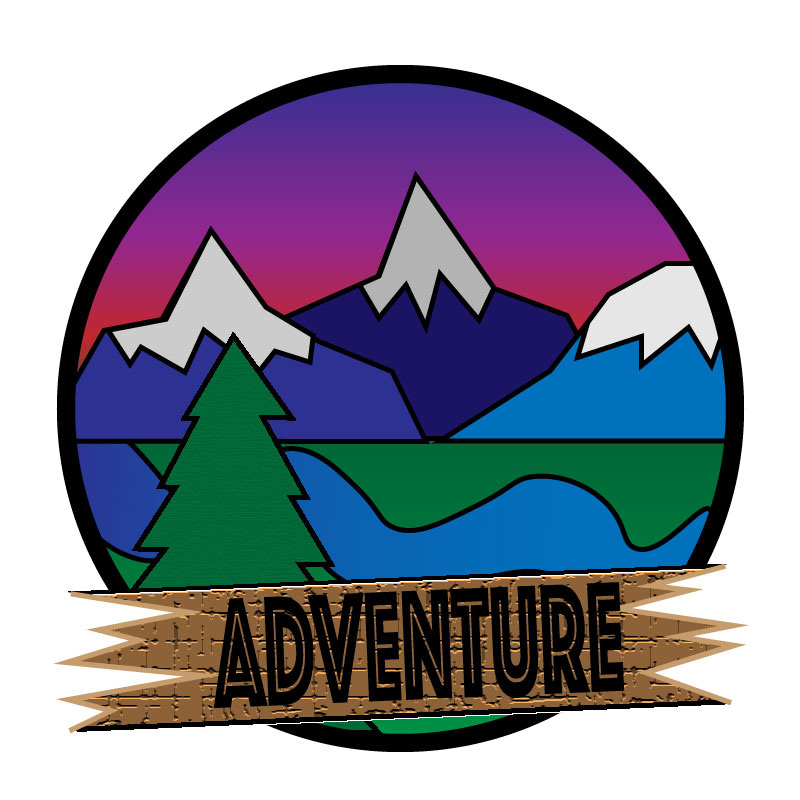
I really enjoyed making this project. At first the tutorials seemed complicated, and I thought to myself that I would never get the hang of it. But once I started working on my own my piece really started to take shape. The hardest thing about the tutorials in my opinion was the gradient tool. Every time I tried to fix the gradient on something it wouldn’t work out. Trying to make an image 3 dimensional like the pen was proving to be a very hard challenge.
once I wrapped my head around how it worked it became very fluid and easy to work with. For example, the sunset in my photo is the gradient tool at work. I simply selected the colors of a sunset and fortunately it worked out. Most of my inspiration for the peace comes from all of the prior research I had done figuring out my tattoo. So, I already had an idea about how it was going to look based off of that research. Something I couldn’t quite figure out though was how to change the gradient of the letters in “adventure”. I tried so many different approaches to change the gradient from red to yellow, like in my last assignment. But for some reason I couldn’t figure out what went wrong. I will be attending class at some point next week to get the answer to my questions. But overall, I really enjoyed the freedom that this project allowed me. I think that I learn more when given freedom to experiment with the program rather than doing the tutorials. Problem solving really makes these projects what they are. For example I wanted every object behind the circle, but I also needed the grass and sunset behind the cutouts of the trees and mountains, so a solutions that I figured out was to make two layers, one of the layers was for the circle surrounding the image, and the other was for the gradient behind all of the cutouts.

Hi Griffin!
I am really impressed with your first draft of your logo! I absolutely that you used the gradient tool to make it look like an awesome sunset behind the mountains! It also looked like you used different texture tools to give the wood and some of the trees a texture, which adds so much detail! Overall I think you have a very strong draft! My first suggestion would be to maybe make the word “adventure” something that is more clear to see. With the texture of the wood in the background and the type of font you used, at first glance it may be hard for some people to understand or see it clearly at first. I would just suggest maybe making that font solid and a more vibrant color so that it pops out completely and stands out! My second suggestion would be to add that texture that was used on the tree on the grass as well, and if you can, to add texture to the water or mountains in the background! Other than that, I think you have a very strong first draft and I can’t wait to see how your final draft comes out!
Paige Tullis
LikeLike
I think this overall is a really cool logo! I like that you layered the mountains, and made the one behind darker as it would naturally be. I also really like the sunset gradient! This seems pretty complex, and I think you did really well with it! The the log behind the word “Adventure” has a really nice texture to it, although it makes it difficult to read the lettering. I think experimenting with fill colors and looking at some other similar fonts could help make it stand out more. I also feel like there should be a bit more separation between the mountains and sky side with the grass and river side. Maybe experimenting with the hue and saturation levels of either side just to make a distinction. I just feel like the colors kinda mesh together (but my eyes are also trash).
Overall, I like the concept and the amount if work you put into this!
LikeLike
Self-reflection
I really liked how I did mine, I thought I was pretty creative with the ways I used the illustrator tool. I think that some of my biggest problems is trying to cram in too much information in one photo. For example, I think that having the mountains trees and river is way too much information for a logo and it ends up looking clustered and unorganized. But based off the comments I’ve received I think I’m going to change 2 major things. The first thing that I am going to change is the lettering, I don’t think the black looks good in contract to the brown background. I think I’m going to do the yellow fade into red letters like I did on the photoshop assignment. The last thing I’m going to do is try and play with the contrasts of my shapes so they all stand out and don’t fade into one another.
LikeLike
The first thing I noticed when I looked at your logo was how well as the colors mesh with each other and it creates a logo that just works. All the mountains and the tree that you drew are nicely done and the river going through the center of the logo looks good as well. One critique that I have for the logo is the text at the bottom that says “Adventure.” With the background behind it, the text can be kind of hard to read when you first look at it. A different color would probably be the way to go to make it more readable and would greatly enhance the logo. Another critique is a small one that has to do with the center of the logo. Where the mountains meet, there is a little green spot which was at least for me noticeable. If you connect the mountains a bit more it would easily fix it. Besides those two things, the logo looks good!
LikeLike