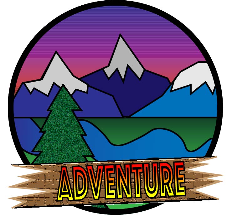
This project was a really fun way to experiment with illustrator tool. The main learning that comes from these projects is trial and error, and I think that it really helps me understand the program a lot more. During the sketching of the logo I went through many trials. I would sketch and sketch and couldn’t come up with a design I liked, but once I settled on my favorite and started to work on it through photoshop it really started to take shape. During the first my project really started to take shape. I learned a lot about the program while going through it. One of the main things that I learned was how to properly use the gradient tool. The main things I used this for was for the sunset. I was able to add multiple colors to make the illusion of a sunset in the background of my photo. But the main difficulty I had with the draft was that I couldn’t figure out how to make my letters pop out to my audience, and I also wanted my tree on the bottom right to pop out. So, while working on the final draft for my project my two main goals was to fix my letters and make them pop out more and fix the tree so that it too popped out. I couldn’t figure out how to make the letters, so I went into class and my TA was able to help me figure out to apply a gradient. The next thing that I did was fix my tree. The simple way to do that was to just put more texture on the tree. The last things that I did was that I wanted the grass to have more depth so I added a darker gradient so that the grass looked like it trailed off.
